Case study · Automotive · E-commerce

Sergio Escobar: car maintenance you can choose and prepay online

A Chilean car dealership wanted customers to prepay vehicle maintenance online, but every price depended on brand, model, fuel type and service level. I led the research and designed a flow that turns that price matrix into a few simple choices.

Year
2023
Role
UX/UI Designer at Somos Forma (agency), leading research and design
Scope
Stakeholder research, information architecture, e-commerce UI
Platform
Responsive web store
Try the maintenance configurator
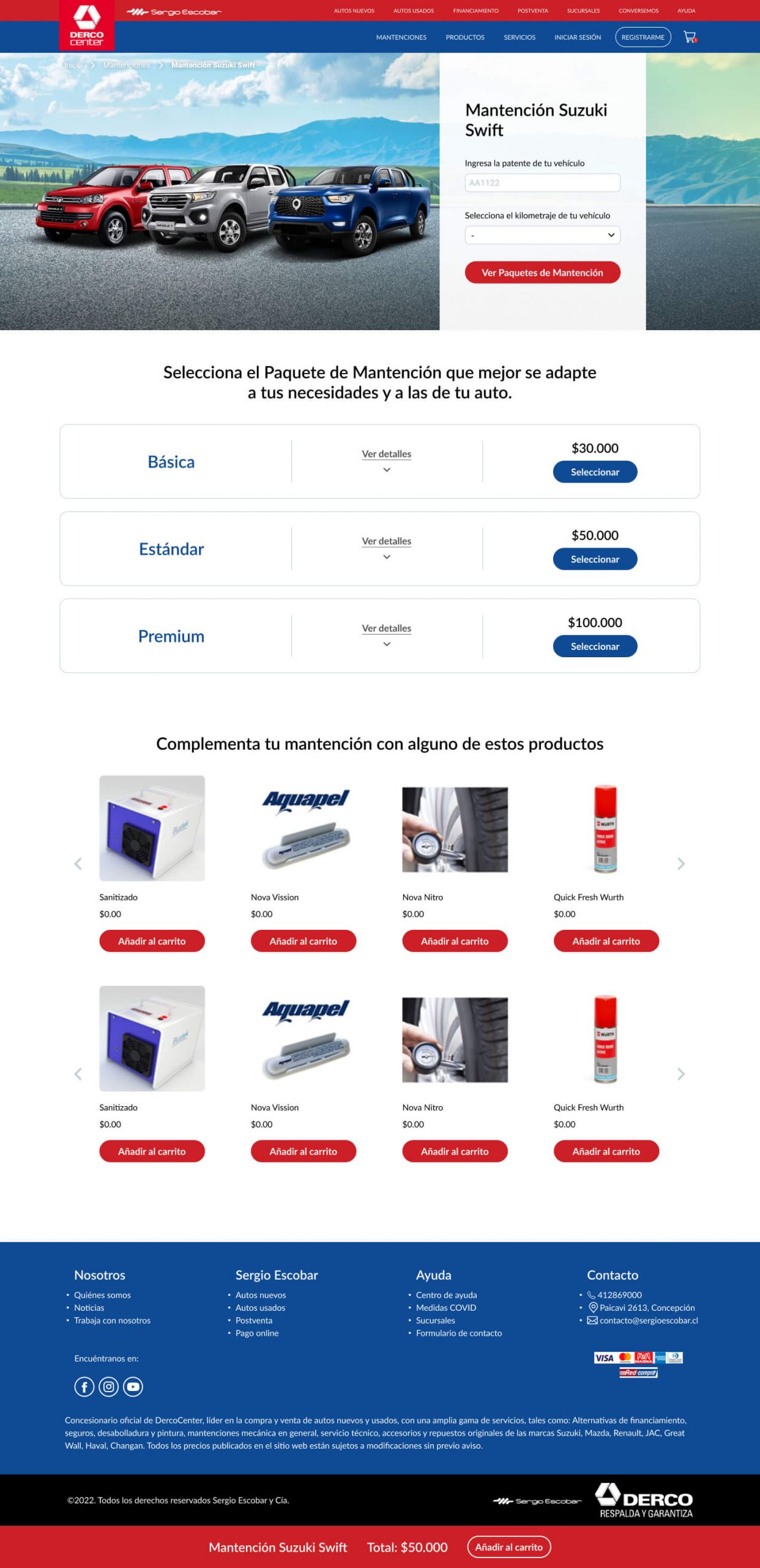
Above-the-fold design of the Sergio Escobar maintenance store.
Overview

The short version

Problem

Maintenance prices varied by brand, model and fuel, each with three service levels. The business wanted to sell them online, prepaid, without a salesperson in between.

What I did

Ran stakeholder research, gave maintenance its own place in the store, and designed a flow where the car defines the options before any price appears.

Outcome

The store shipped to production with Somos Forma. It has since been redesigned by another team.

Context

A dealership with a pricing puzzle

Sergio Escobar is a Chilean automotive group that sells new and used cars, accessories and maintenance services. The goal of the project was to let customers prepay their vehicle maintenance online, so the process could be automated.

The catch: each maintenance service had three attributes (brand, model and fuel type) and three variations (Basic, Standard and Premium) whose contents and price depended on those attributes. A plain product grid would have meant hundreds of near-identical products.

How might we turn a brand × model × fuel × tier price matrix into one confident choice?

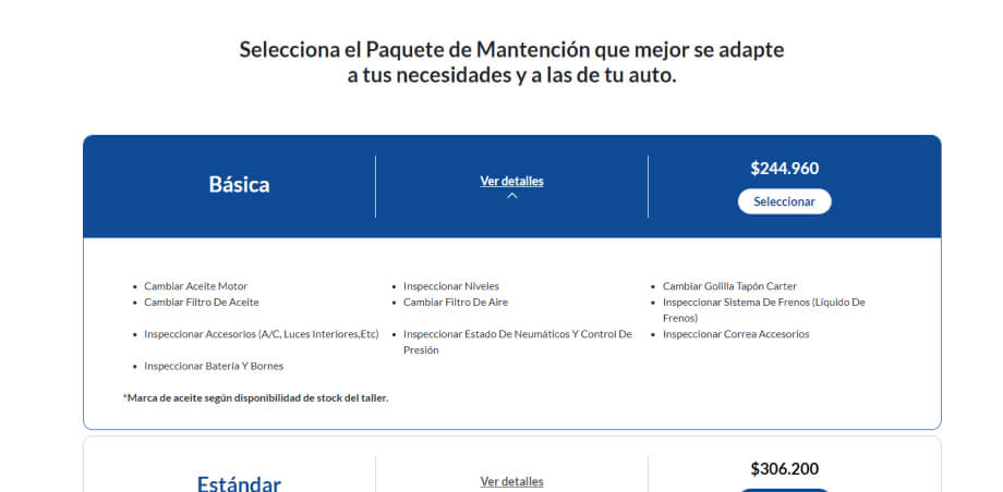
Package selector: Basic package expanded with its list of included services and price.
The answer, in one component: three comparable packages, details on demand, and the price for your specific car.
Research

Understanding the business, the customer and the market

I started with the people who knew the operation best, then looked outward at how others solved scheduling and paying for maintenance.

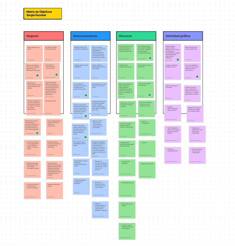
Business objectives matrix from the stakeholder workshop.

Stakeholder workshop

We defined and prioritised the business objectives for the store together.

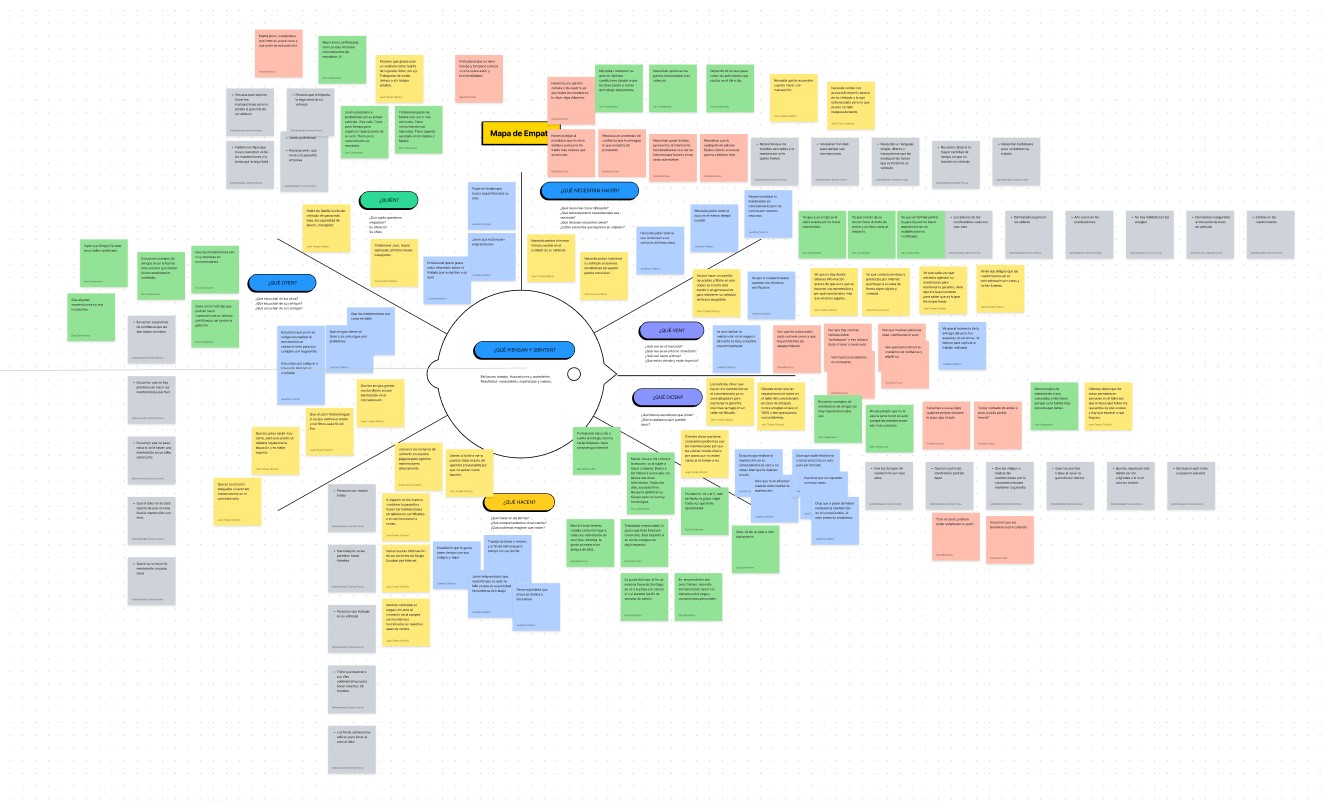
Empathy map of the dealership's customers built with stakeholders.

Empathy map

Built with the stakeholders, based on their daily experience with customers.

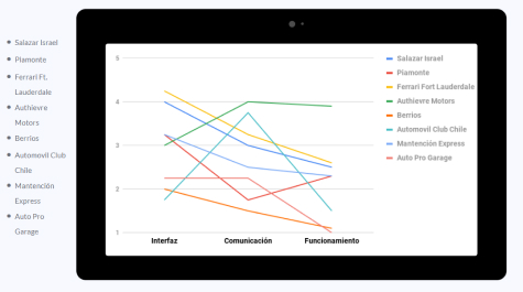
Benchmark chart scoring eight maintenance booking services on interface, communication and operation.

Benchmark

Eight digital maintenance booking and payment services, scored on interface, communication and operation.

Key decisions

Five decisions that shaped the flow

Most of the complexity lived in the data, so most of the design work went into hiding it at the right moment.

Maintenance first in the store’s architecture

The online store lived on its own subdomain, linked from the main site. In its information architecture, Maintenance became the first section, ahead of products and services, with a customer account that remembers my vehicles.

Why: maintenance was the business objective with the clearest operational payoff, so it had to be the most visible path, not one product category among many.
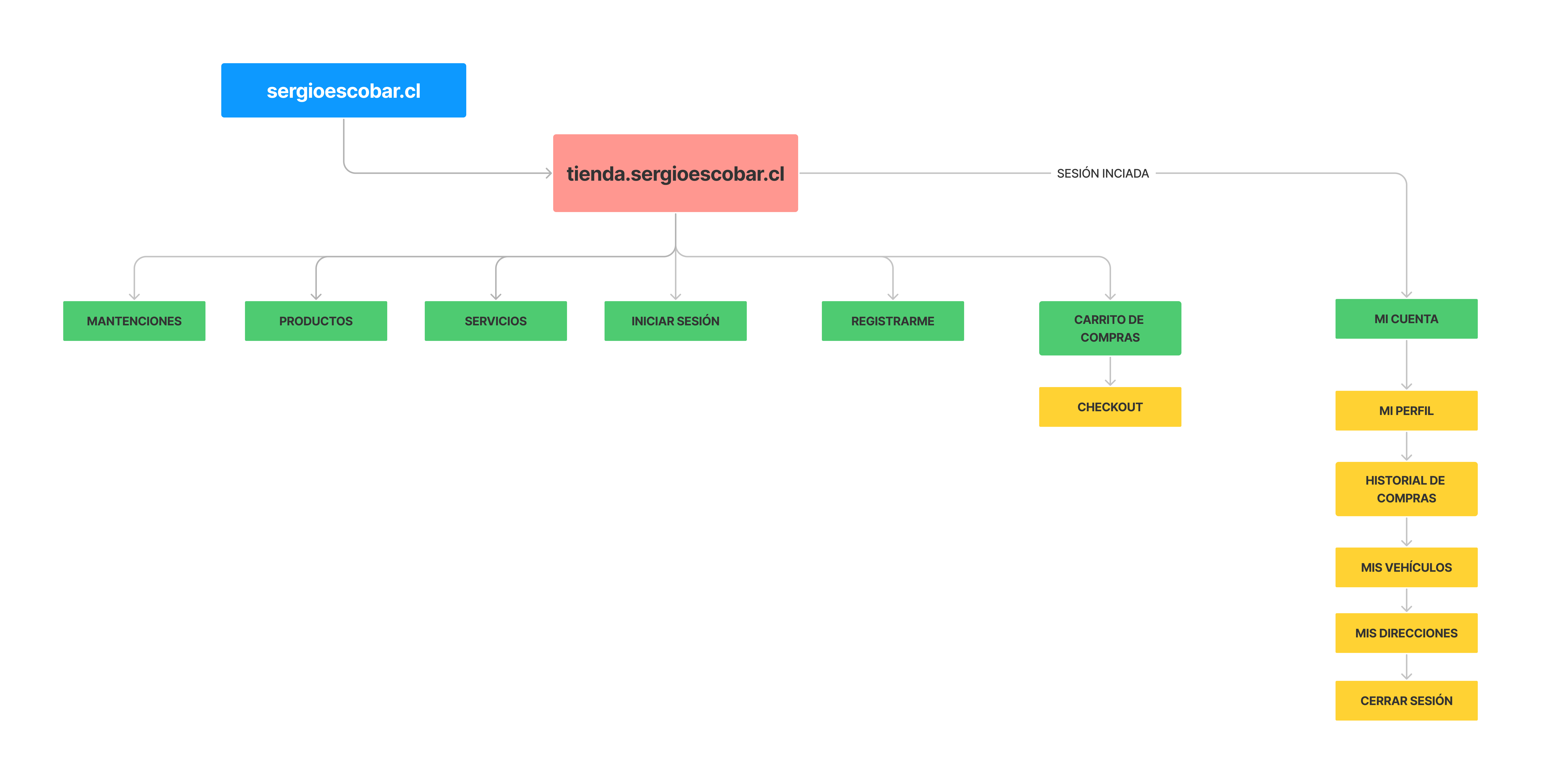
Information architecture of the store: maintenance, products, services, login, cart and account.

Let the car decide what you see

Before showing any package, the flow asks for the car: model, then licence plate and mileage. Only the plans that apply to that car appear, already priced.

Why: showing every combination would force people to find themselves in a table. Asking two questions they can answer instantly removes the wrong options entirely.

Top of the maintenance page with the car form.

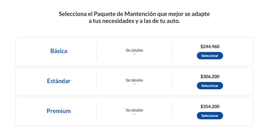
Three packages you can compare at a glance

Each package is one row with the same three parts: name, “View details” and price with a select button. Details expand in place, so you can compare without leaving the page.

Why: the user only needs name, contents and price to decide. The card format was one of the elements we iterated on most with the client until it read clearly.

Three package rows: Basic, Standard and Premium with prices.

Extras after the decision, not before

Complementary products sit below the packages, after the main choice in the reading order, and a sticky bar keeps the selected service and running total in view with “Add to cart”.

Why: putting extras before the main choice would add noise to the hardest decision. After it, they read as an option, and the total is always visible.

Full maintenance page: car form, packages, complementary products and sticky total bar.
Disagree and commit

Keeping the main navigation visible

I proposed moving the dealership’s main menu into a burger menu so the store could focus on maintenance. Because the store was part of an existing website, the client chose to keep it visible.

What I did: designed within that constraint, giving the maintenance entry point priority inside the existing navigation instead of fighting it.

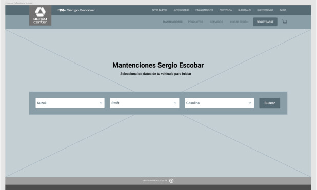
Home page wireframe with the main navigation.
Working prototype

Configure a maintenance yourself

I rebuilt the core flow in code, so you can use it instead of looking at screenshots.

  • Pick brand, model and fuel
  • Enter any plate and your mileage
  • Compare packages and add extras

The interface is in Spanish, as it shipped for the Chilean market. Brands, models, the Standard and Premium contents, and all prices are illustrative.

Carrito 0
UI

Built on the client’s brand manual

The interface follows Sergio Escobar’s brand manual: corporate blue for structure and selection states, red reserved for primary actions and the sticky total bar, so the eye always finds the next step.

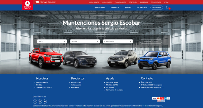
Store home, above the fold.
Store home, above the fold
Expanded package with included services.
Package details expanded in place
Outcome

Shipped, then redesigned by others

The maintenance store went to production, delivered with the team at Somos Forma. The site has since been redesigned by another team, so this case shows my original work. I don’t have post-launch metrics, and I won’t invent them.

Delivered

Information architecture, home and maintenance flow, package selector, cart and account structure.

Simplified

A price matrix by brand, model, fuel and tier became two questions and three comparable packages.

Status

Launched in production. Later replaced by a newer redesign.

What I’d do differently today

Talk to customers directly. The empathy map came from stakeholders’ experience. Even five short interviews with customers who book maintenance would have tested those assumptions.

Usability-test the package selector. It was the heart of the flow, and a quick test would have shown whether people compared packages or just picked the cheapest.