Case study · Finance · Cooperative banking

Coopenae: a cooperative bank’s website, reorganised around what members need

Coopenae’s website mirrored its internal structure, not the questions people came with. In three weeks I redesigned the full experience, 45 desktop and mobile screens, so members and businesses can find the right product in a few steps.

Year
2025
Role
Lead UX/UI Designer at Somos Forma (agency), working directly with the client
Scope
Workshops, research, information architecture, UI and handoff to development
Delivery
45 desktop and mobile screens in 3 weeks
Try the redesigned navigation
Coopenae product page with information organised in accordions.
Overview

The short version

Problem

The website was organised like the institution’s org chart. People had to know how Coopenae works inside to find a loan or a savings account.

What I did

From the first business-goals workshop to the handoff to development: diagnosis, alignment workshops, a new architecture by profile and need, and a UI built from scratch.

Outcome

Delivered on time and passed straight to development with no redesign round. The client highlighted how much easier the information is to find.

Context

A trusted institution with a confusing front door

Coopenae is a leading institution in Costa Rica’s cooperative sector, with almost 60 years of history. Its website is the main point of contact for people considering becoming members, but it had become a repository of information organised by internal processes.

I worked through Somos Forma, in direct contact with the client. My counterpart was Coopenae’s Marketing team, who in turn reported to the executive team, so every key decision had to be easy to explain upwards.

Cooperative finance was new to me. Coming in without inherited assumptions helped me question structures the internal team no longer saw.

How might we organise a whole financial offer around what people want to achieve, not around how the institution is built?
Full redesigned Coopenae home page.
The redesigned home, organised by profile and need.
Research

Diagnose first, even with three weeks

The deadline was tight, so research had to be fast and decisive. I combined an expert review of the old site, a look at how the market solves the same problem, and the knowledge of the people who answer members’ questions every day.

Heuristic evaluation

The structure was the problem

The old site failed mostly on consistency and on matching the real world: its architecture reflected administrative processes, not users’ mental models.

Benchmark of financial and fintech websites.
Benchmark. How financial and fintech references structure their information, to reuse navigation patterns members already know.
Alignment workshop board with stakeholders.
Alignment workshops. Two 2-hour sessions where we built the diagnosis together instead of presenting a solution to approve.
Stakeholders as a proxy

Their knowledge filled the gap testing couldn’t

We couldn’t test with external users in the timeframe. The Marketing team brought what no benchmark could: which questions created the most call-centre calls, which sections confused people in branches, and which products had high interest but low conversion. That shared knowledge, checked against my structural analysis, set the priority of the flows.

AI to speed up judgement, not replace it

Gemini helped me group the old content inventory by theme, so I arrived at the workshop with a taxonomy hypothesis in hours instead of days of manual sorting. ChatGPT gave me three simplification options for each of the 30 inherited content blocks. My rule for choosing was always the same: less cognitive load without losing the legal precision a financial cooperative needs.

Diagram of how AI was used in the content process.
AI generated options; I made the decisions.
Key decisions

Five decisions that shaped the site

With 21 days and 45 screens, deciding what not to do mattered as much as deciding what to do.

Organise by profile and need

The new architecture splits the offer into For you and For your business, with three levels: the home as a hub, category pages that route you, and product pages where you convert.

Why: people arrive with a goal (“buy a house”, “pay my team”), not with the name of a department. Starting from the profile removes half the options at once.

Home page showing the For you and For your business split.
Hard call

What I deliberately didn’t design

In the workshop the client wanted three secondary flows. Adding them would have fragmented the core architecture before it was validated, so I proposed documenting them as planned design debt, with specs for a second phase.

How it landed: it meant giving the client less than they asked for in order to give them what they needed. Showing on the comparative sitemap how those flows would have broken the new hierarchy got the decision accepted.

Hard call

3 secondary flows moved to phase 2, fully specified.

The client was right

From tabs to accordions

My first proposal used tabs. The client asked for accordions. Instead of defending my option by default, I checked the request: on mobile, tabs fragment the content and hide context, while accordions allow linear reading and work better with screen readers.

What I did: the client was right, and I said so with the technical reasons. Acknowledging it strengthened trust in the process.

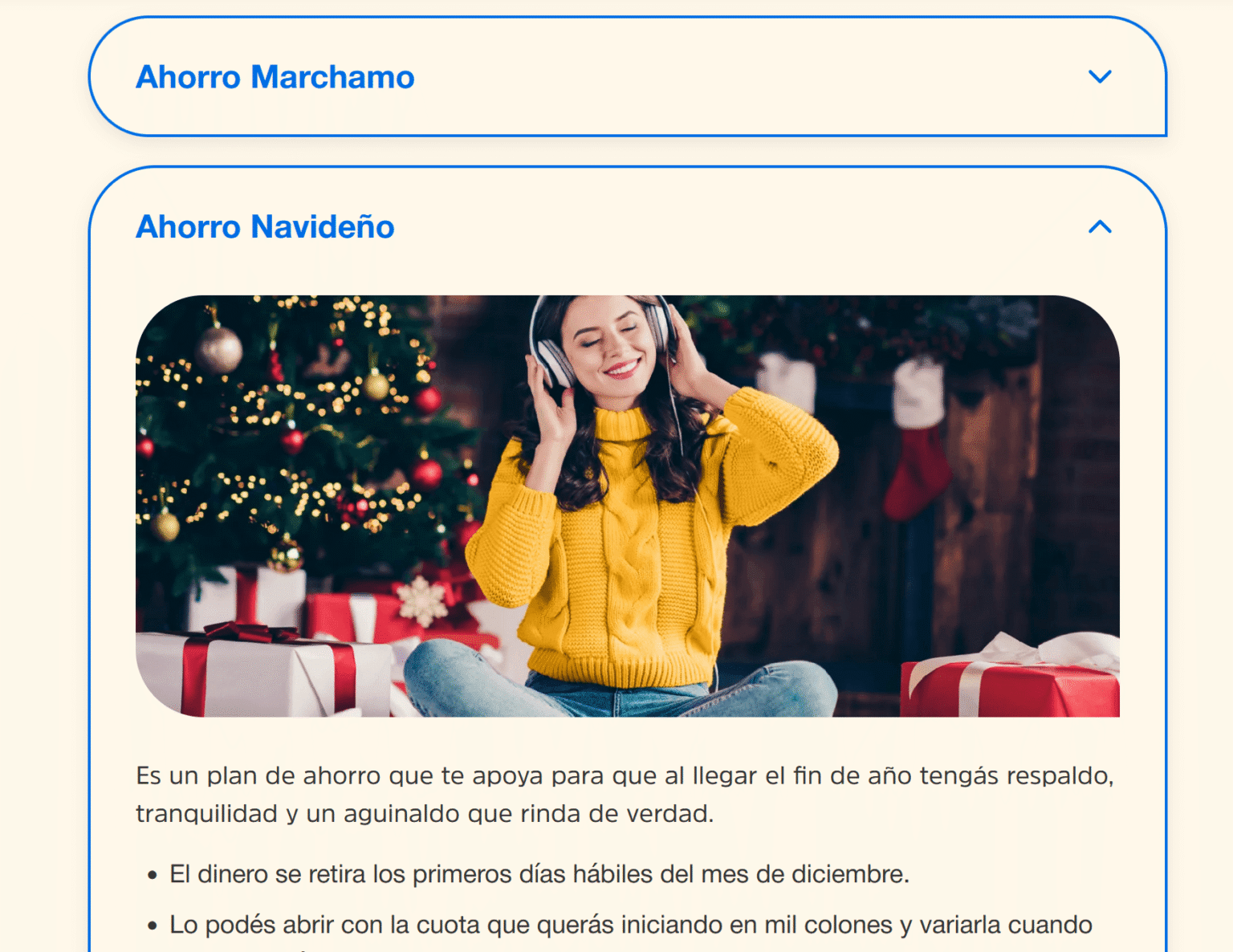
Product page with accordions for benefits, requirements and FAQ.

A product card that sells a benefit

The product card took three versions. The first two failed for the same reason: they led with what the product is instead of what it does for the member.

The change: I reframed the design question from “what is this loan?” to “what life problem does it solve?”. That turned an informative component into a conversion point.

Product card designs for Coopenae.

Feedback you can’t miss

Every UI element was created from scratch. Hovers and CTAs got clearly visible states, and progressive disclosure keeps technical details hidden until someone asks for them.

Why: if the old structure was confusing, the new interface had to answer every action in an obvious, confirming way.

Icon buttons in default and hover states.
Working prototype

Find a product the new way

I rebuilt the core navigation in code: profile, need, benefit-first cards and a product page with accordions.

  • Switch between For you and For your business
  • Pick a need
  • Open a product and its accordions

The interface is in Spanish, as it shipped for Costa Rica. Product names and contents are illustrative, not Coopenae’s real conditions.

UI

Designed for mobile reading

The visual system works as a navigation map: corporate blue for structure and states, warm yellow for actions, and accordions that turn long financial content into short, scannable steps on any screen.

Mobile product page with accordions.
Mobile product page
Benefit-first product cards.
Benefit-first product cards
Icon buttons with hover states.
Icon buttons with clear hover states
Outcome

On time, straight to development

The 45 desktop and mobile screens were delivered on schedule, with annotations for development and a documented component library. The team went straight into development without a redesign round, and the site is live at coopenae.fi.cr. I don’t have post-launch metrics, and I won’t invent them.

The client’s feedback: the reorganisation of the information turned out wonderful, and it is now much easier to find what users need.

Delivered

45 screens for desktop and mobile, development annotations and a component library.

Simplified

An architecture by internal process became one by profile and need, in three levels.

Status

Handed off with no redesign round. Live in production.

What I’d do differently today

Test with members, even briefly. Stakeholders were a strong proxy, but a quick tree test with real members would have validated the new architecture before the UI.

Set a findability baseline. Measuring how long it took to find key products on the old site would have made the improvement measurable after launch.