Case study · Fintech · Web app

Divisso: making a mortgage application doable on a phone

A Chilean proptech startup had a desktop-first mortgage application, while three out of four of its users arrived on mobile. I evaluated the flow, simplified it and designed the new mobile and desktop UI, working directly with the CTO.

Year
2024
Role
UX/UI Designer (freelance)
Scope
UX evaluation, flow redesign, mobile + desktop UI
Worked with
The CTO, directly
Try the working prototype
Overview

The short version

Problem

Applying for a mortgage meant a 6-step, desktop-first flow full of long yes/no question lists. Most users were on mobile.

What I did

Reduced the flow to 5 steps, replaced generic inputs with choice cards and a term slider, and chunked the long forms into accordions.

Outcome

The new mobile and desktop UI shipped to production. Months later the startup pivoted to a different business model.

Context

A high-stakes form, filled in on a small screen

Divisso helped people in Chile buy a home by quoting their mortgage with several lenders at once. Its core product was the application: property details, income, debts and documents, all needed before anyone could quote.

The company had already run user interviews and usability tests, so the information it needed to collect was defined. My job was different: evaluate how that information was being asked for, and make the experience work for the people actually using it.

75.6%of users arrived on mobile
Analytics chart: users by device category. Mobile 75.6%, desktop 22.8%, tablet 1.6%.
Users by device category, from the product’s analytics. The application had been designed for desktop.
The problem

The existing flow asked a lot, and asked it badly on mobile

Reviewing the existing application, the issue wasn’t the amount of information. A mortgage needs it. The issue was how much effort each question demanded, and how little the interface helped people keep going.

  • Six steps in a side navigation built for wide screens, with income asked in its own step, separate from the rest of the applicant’s details.
  • Long lists of yes/no questions with small default radio buttons, shown all at once.
  • Applicant and co-signer side by side in two dense columns of fields, which simply doesn’t fit on a phone.

How might we make a long, unavoidable application feel short, clear and finishable on a phone?

Existing desktop flow: income step with a six-step side navigation and two columns of fields for applicant and co-signer.
Before · the income step of the existing desktop flow.
Existing desktop flow: applicant details step with a long list of yes/no radio questions.
Before · applicant details: long lists of yes/no radios.
Key decisions

Four changes to the flow, and why

Since the research was already done, I focused on interaction cost: fewer steps, fewer decisions on screen at once, and immediate feedback where people needed it most.

From 6 steps to 5

I merged income into the applicant details step, next to work, debts and the future property, where it belongs from the user’s point of view. The stepper now shows the step number, name and a one-line description, plus a progress bar.

Why: every extra step is a moment to drop out. Grouping by what the user is describing, not by what the back office needs, makes each step feel coherent.

Mobile stepper component with five numbered steps, step title, description and progress bar.

Choice cards instead of radio buttons

Questions like “what stage of your purchase are you in?” became large cards with a title and a short helper line, for example “I need financing as soon as possible: I already chose a property or signed a purchase promise”.

Why: the helper text answers “which one am I?” before the user has to guess, and the whole card is a comfortable touch target.

Choice card and yes/no button components in default and active states.

A term slider that shows the monthly payment

Choosing between 10 and 30 years became a slider that updates the estimated monthly payment as you move it.

Why: the term is the one decision with an immediate, personal consequence. Showing the payment turns an abstract number of years into something people can actually judge.

Step 2 screen with a loan term slider from 10 to 30 years and the estimated monthly payment.

Accordions and Applicant / Co-signer tabs

The longest step was split into four collapsible sections (personal data, work and income, debts and expenses, future property) and two tabs, so the applicant and the co-signer each have their own space.

Why: showing four short headings instead of dozens of fields makes the step look finishable, and lets people complete it in any order.

Step 3 screen with Applicant and Co-signer tabs and four collapsible form sections.
Working prototype

Try the flow yourself

I rebuilt the redesigned mobile flow in code, so you can use it instead of looking at screenshots.

  • Pick your purchase stage. “Continuar” only unlocks once you’ve answered.
  • Move the term slider and watch the monthly payment update.
  • Open the accordions and switch between Titular and Codeudor.

The interface is in Spanish, as it shipped for the Chilean market. Payment figures are illustrative, and some content (especially steps 4 and 5) is simplified.

    UI system

    Small, consistent components

    I started from Divisso’s brand guidelines (navy, mint and teal, set in Montserrat) and built the components first: buttons, inputs shaped like the buttons, choice cards, the stepper and a sticky bottom bar that keeps “Continuar” and “Atrás” always within thumb reach. The same components then scaled to the desktop layout.

    Divisso brand guidelines: logo on navy, colour palette and Montserrat weights.
    Brand foundations
    Primary and secondary button components and their states.
    Buttons
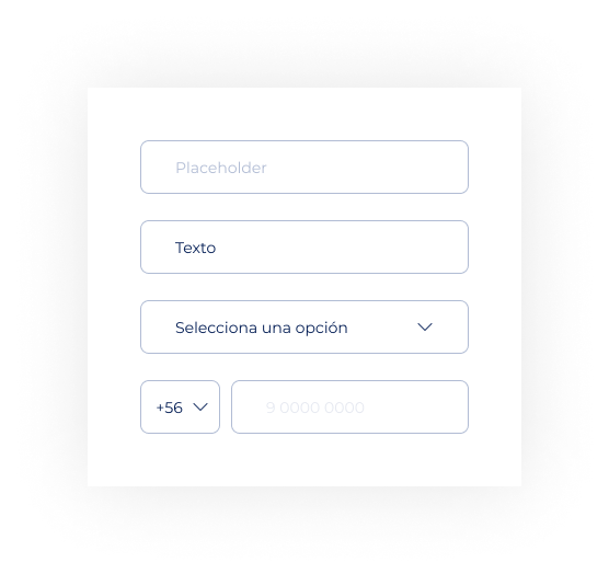
    Form input components.
    Inputs
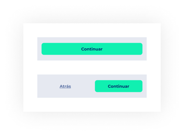
    Bottom navigation bar with Continue and Back actions.
    Sticky bottom bar
    Outcome

    Shipped, and then the startup pivoted

    The redesigned flow and the new mobile and desktop UI went to production. A few months later Divisso changed its business model, as startups do, so there was no long-term data to measure the redesign against. I prefer to say that than to invent numbers.

    Delivered

    Mobile and desktop UI for the full application flow, plus a reusable component set.

    Flow

    6 steps became 5, and the longest form was grouped into four short sections.

    Status

    Live in production until the company pivoted to a new model.

    What I’d do with more time

    Measure drop-off per step. The product already tracked devices. Adding step-level completion would have shown whether merging income into applicant details actually reduced abandonment.

    Test the payment slider. It was the most novel interaction in the flow, and worth a quick usability test to confirm people read the estimate as an estimate.